Graphs for state change or phase change | change of state – graphs
In this post, we will study the Graphs for state change (phase change graphs or change of state graphs). We have already studied the keywords related to the state change or phase change here.
Sketching and interpreting phase change graphs (change of state – graphs)
The three change of phase graphs (drawn below) all have time on the horizontal axis, but alternatively, the energy transferred could be used instead, and the graphs would still have similar shapes.
Phase change graph – 1
When a hot substance (which does not change phase) is allowed to cool naturally, its temperature will fall as shown in Figure 1. The rate of cooling at different temperatures may be determined from the gradients of the graph.
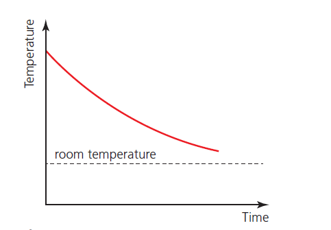
The greater the difference between the temperature of the substance and the surrounding temperature, the more thermal energy per second is transferred away from the substance.
Phase change graph – 2
Figure 2 shows how this pattern of cooling changes when there is a change of phase. This example shows a substance solidifying (above room temperature). Note that the temperature remains constant during the time taken for the solidification (as mentioned above).
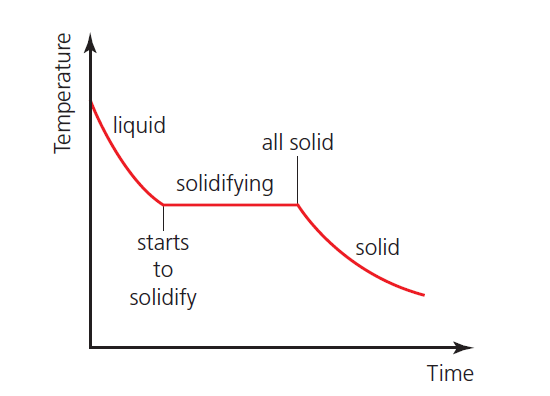
The same pattern would be seen in the temperature of a gas condensing to a liquid.
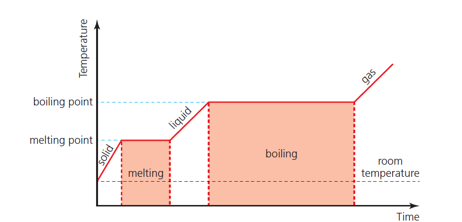
Phase change graph – 3
Figure 3 shows the idealized example of a solid being heated at a constant rate (without energy losses) until it has all changed to a gas.